
Every time you step into a room, your mind registers the environment and triggers a subconscious psychological reaction. While furniture, lighting, and layout play vital roles in interior design, color is arguably the most powerful tool for influencing mood and behavior. The shades applied to walls, textiles, and decor do not merely decorate a home; they fundamentally dictate how that space feels.
Understanding environmental psychology allows homeowners and designers to curate environments that align with the specific functions of different living spaces. By strategically selecting palettes based on how the human brain processes color, you can transform a chaotic room into a sanctuary, or turn a stagnant home office into a hub of creative energy.
The Biological and Emotional Impact of Color
Human responses to color are rooted in a combination of evolutionary biology and cultural conditioning. When light strikes the eye, it travels to the hypothalamus, the part of the brain responsible for regulating hormones, sleep cycles, and emotional responses. This means that color perception is a physiological experience capable of altering heart rates, respiration, and cognitive performance.
While individual preferences exist, certain hues universally evoke specific psychological states. Warm tones generally stimulate and energize, whereas cool tones soothe and ground. Navigating these distinctions is the key to creating a balanced, harmonious home.
Warm Colors for Energy and Social Interaction
Warm colors occupy one side of the spectrum and include reds, yellows, oranges, and rich earth tones. These shades are naturally stimulating, making them ideal for spaces designed for high activity, conversation, and creativity.
Red: Passion and Appetite
Red is the most intense color in the psychological spectrum. It raises the heart rate, increases adrenaline production, and stimulates the appetite. Because of its high energy, full red walls can easily become overwhelming or induce feelings of irritability in a living space.
-
Best Applications: Use red in dining rooms to encourage lively conversation and enhance the dining experience, or as an accent color in entryways to create a dramatic, welcoming first impression.
Yellow: Optimism and Intellect
Yellow mimics the effects of sunlight, triggering the release of serotonin in the brain. It is associated with happiness, clarity, and mental agility. However, highly saturated yellow can strain the eyes and provoke anxiety if used excessively.
-
Best Applications: Soft, buttery yellows work beautifully in kitchens and breakfast nooks to cultivate a cheerful morning atmosphere. Muted ochres can add warmth to a living room without overwhelming the senses.
Orange: Social Vitality and Warmth
Orange combines the physical energy of red with the cheerfulness of yellow. It promotes a sense of playfulness, enthusiasm, and social interaction. It is a highly hospitable color that naturally draws people together.
-
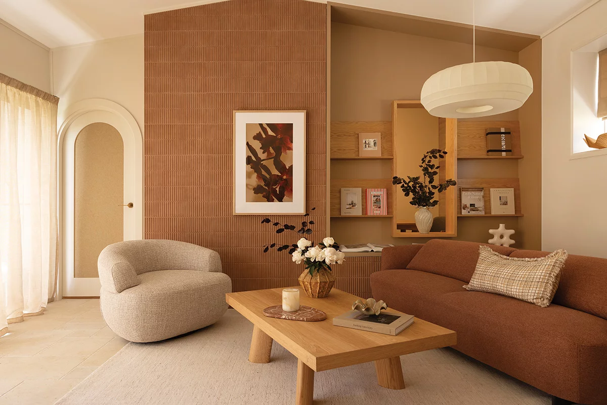
Best Applications: Terracotta, rust, and peach tones are excellent for family rooms and lounge areas where you want to foster a sense of community and relaxed conversation.
Cool Colors for Serenity and Focus
Cool colors include blues, greens, and purples. These shades slow down human metabolism, lower blood pressure, and create a sense of expansiveness and tranquility. They are highly effective in areas intended for relaxation, rest, or deep thought.
Blue: Trust and Tranquility
Blue is globally recognized as the most calming color. It encourages the body to produce calming chemicals, making it the quintessential choice for unwinding. Dark blues evoke stability and deep thought, while light blues create an airy, spacious feeling.
-
Best Applications: Bedrooms benefit immensely from soft blues, as the color supports healthy circadian rhythms and prepares the mind for sleep. Home offices also utilize mid-tone blues to foster sustained mental focus without stress.
Green: Renewal and Balance
Positioned at the center of the color spectrum, green is the easiest color for the human eye to process. Because of its strong association with nature, green signifies growth, safety, and emotional balance. It acts as a bridge between the stimulation of warm colors and the sedation of cool colors.
-
Best Applications: Green is highly versatile and works in almost any room. Sage green can transform a bathroom into a spa-like retreat, while deep emerald greens add a grounding, sophisticated comfort to a living room.
Purple: Luxury and Contemplation
Purple combines the stability of blue with the energy of red. Historically associated with royalty, deep purples evoke luxury, sophistication, and spirituality. Lighter shades, like lavender, offer a gentle, dreamy serenity that reduces mental clutter.
-
Best Applications: Deep plums work well in formal sitting rooms or libraries to create a sense of mystery and depth. Lavender is ideal for nurseries, guest bedrooms, or meditation spaces.
The Role of Neutrals and Achromatics
Neutrals form the foundation of most interior designs. While they may seem passive, blacks, whites, grays, and browns possess distinct psychological undercurrents that shape how other colors behave in a space.
White: Clarity and Cleanliness
White reflects light, making spaces feel larger, cleaner, and more open. In excess, however, pure clinical white can feel cold, sterile, and isolating, reminiscent of a medical facility.
-
Design Strategy: Opt for warm whites with undertones of cream or ivory to keep a space inviting while maintaining a minimalist, clutter-free aesthetic.
Gray: Sophistication and Balance
Gray is completely neutral, meaning it lacks an inherent psychological pull of its own. It is a color of compromise and stability. Dark grays offer a modern, dramatic enclosure, while light grays provide a sleek, quiet backdrop.
-
Design Strategy: Because gray can become depressing or monotonous if overused, it should always be paired with contrasting textures like wood, metallic accents, or pops of color to give the room dimension.
Brown and Earth Tones: Grounding Security
Brown is deeply rooted in the natural world, evoking the stability of earth and wood. It provides a profound sense of security, comfort, and reliability.
-
Design Strategy: Incorporating natural wood furniture, leather, or linen textiles brings organic warmth to a room, making large spaces feel cozy, safe, and anchored.
Designing with the 60-30-10 Rule
To prevent a living space from feeling chaotic or emotionally exhausting, interior designers use a classic rule to balance color ratios. This approach ensures that the eye can navigate a room comfortably without experiencing sensory overload.
-
60 Percent (The Dominant Color): This is the main color of the room, typically applied to the walls, large rugs, or major furniture pieces. It sets the baseline mood for the entire space.
-
30 Percent (The Secondary Color): This color should support the dominant shade while providing visual interest. It is used for upholstery, curtains, accent walls, and wood finishes. It should utilize about half as much space as the dominant hue.
-
10 Percent (The Accent Color): This provides the focal points of the room. Applied through pillows, artwork, lamps, and decorative accessories, the accent color gives the space personality and breaks up visual monotony.
Frequently Asked Questions
How do different paint finishes alter the psychological effect of a color?
The sheen of a paint changes how light reflects off the wall. Matte and flat finishes absorb light, softening the intensity of a color and creating a cozy, intimate environment. Glossy finishes reflect light, making colors appear brighter, sharper, and more stimulating, which can increase the overall energy level of a room.
Can color choices in a home affect a person’s perception of temperature?
Yes. Studies in environmental psychology show that people perceive rooms painted in warm colors like red, orange, or yellow to be a few degrees warmer than they actually are. Conversely, rooms painted in cool blues or greens are perceived as cooler, which can influence how you utilize heating and cooling systems throughout the year.
What is the best color palette for someone dealing with chronic anxiety or high stress?
A palette built around low-saturation, muted tones is best for managing anxiety. Soft sage greens, pale blues, and warm taupes are ideal because they do not demand active cognitive attention. Avoiding high-contrast color schemes and bright, saturated primary colors will prevent unnecessary sensory stimulation.
How does color psychology apply to small rooms without natural light?
In windowless or small spaces, the goal is often to counter feelings of claustrophobia. Light, cool colors like soft lavender, pale blue, or crisp mint green are excellent because cool shades visually recede, making walls appear further away than they are. Avoid dark, muddy neutrals, which can make a small room feel oppressive.
Why do certain colors look appealing in a store but cause discomfort once applied to a home wall?
This phenomenon happens due to metamerism, where colors look different under varying light sources. Store lighting is often bright fluorescent or commercial LED, whereas homes use softer, warmer incandescent light. Furthermore, seeing a small color swatch is vastly different from being entirely surrounded by that color, which amplifies its psychological impact.
How can a couple with completely opposite color preferences find a psychological middle ground?
The best approach is to utilize muted versions of their preferred colors or rely on the 60-30-10 rule. If one partner prefers energizing red and the other prefers calming blue, they can choose a neutral background like a warm gray, use a soft slate blue as the secondary color for furniture, and introduce rich burgundy red as the 10 percent accent color through artwork and textiles.
Do children react differently to color psychology in their bedrooms compared to adults?
Children are generally more sensitive to the stimulating effects of color. While bright primary colors like vibrant yellow or red can boost creativity in a playroom, they can cause hyperactivity and sleep resistance in a bedroom. For a child’s bedroom, soft greens, muted blues, or gentle peach tones support both daytime play and evening rest.